Figma Library
Enable Primer's Figma team library
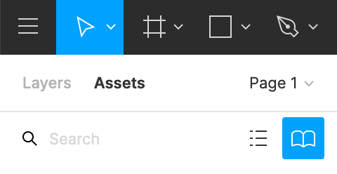
Open a Figma file, and go to the Assets tab at the top of Figma's left-column panel. Click the Library button (the book icon):
The Library button opens a modal window. In the modal's library tab, turn on the switch for Primer Web under Primer Design System:
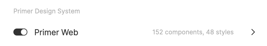
If you do not see Primer Web listed, you may not yet have permissions to access the library.
Add Primer components to your project
With the Primer Web library enabled, Primer's components are listed in the Assets tab of Figma's left-column panel:
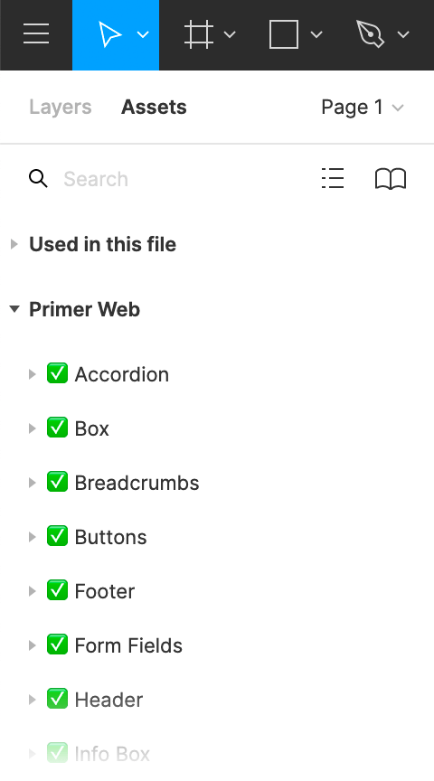
Green checkmarks indicate components that are complete and ready to use. A pencil emoji indicates components that remain a work in progress.
Use the Search field to find the component to use, or browse the categories to find the component you want. Drag the desired component into the canvas of your project.
Figma's help center has more details on working with Figma components.
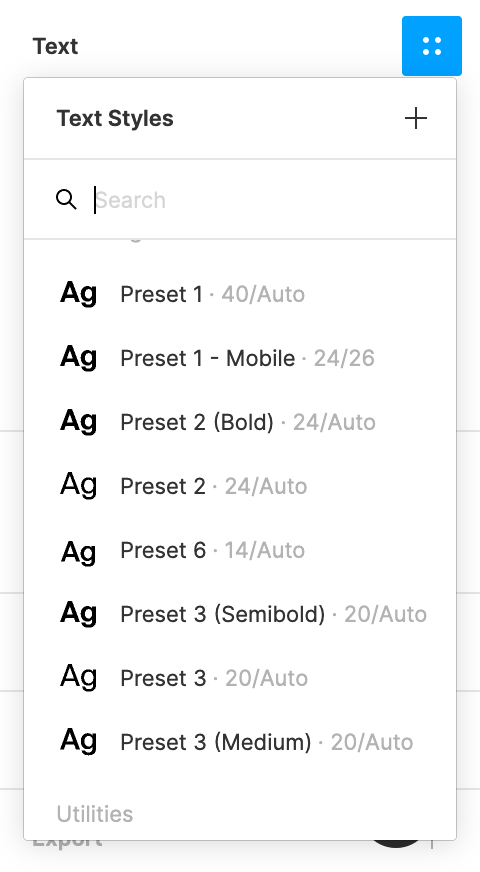
Use Primer text styles in your project
Primer uses a constrained set of typography presets, and the Figma library provides these as text styles. To apply a text style:
- Select the text to edit.
- In the Text section of Figma's right-column panel, click the four-dot Style button.
- Select the Primer preset to use:
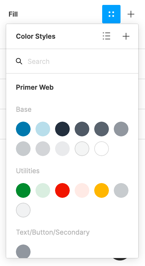
Use Primer colors in your project
The Figma library provides Primer colors as color styles. To apply a color style:
- Select the object for which you would like to apply the color.
- In the Fill section of Figma's right-column panel, click the four-dot Style button.
- Select the color to use: