Typography
Primer provides a compact set of type styles to promote coherence and consistency
About type presets
Type presets are Primer's type styles. They are crafted to provide enough variety to create any interface, but enough constraint to encourage consistency across experiences. These are the atomic typographic units from which all the system’s typography stems.
All Primer-powered digital designs must use only these type presets.
Responsive design. The type presets have responsive sizing built in, with the largest presets (preset 1, 2, and 3) adjusting size between small and large screens.
Bold and italic. Some presets have a bold variation, for use in headings for example. There are no italic presets, although you may use inline styling to add italics to type. For example:
The quick brown fox jumped over the lazy dog.
The <em>quick brown fox</em> jumped over the lazy dog.
Semantic usage. Note that these presets are not explicitly tied to specific semantic elements (h1, h2, h3, etc). This allows designs to maintain both proper semantic structure while also displaying the appropriate visual style for context. For example, a card that uses h3 for its title may use a different type preset than the h3 heading of a content page.
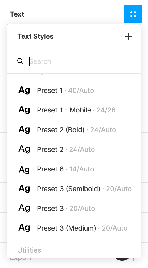
Using type presets in Figma
Apply a type preset to text by assigning the associated text style:
- Select the text to style.
- In the Text section of Figma's right sidebar, click the four-dot Styles icon to reveal the preset styles.
- Select the preset to use.