Radio Buttons
Radio buttons allow users to select a single option from a predefined set of data.
Usage
Radio button fields allow users to select a single option from a predefined data set. If the user needs to select multiple options use the checkbox field field. If there are an excessive amount of options in the data set consider using select field instead.
Anatomy
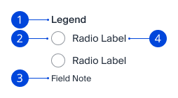
- Legend: Text that informs the user what content they need to enter. Legend is used when there is a group of form controls that are related. Legend does not contain a
forattribute. - Radio Button: The HTML
radioinput where the user selects the option from the predefined list. Primer overrides the default browser CSS styles. - Field Note: Helper text to provide additional context to the field to ensure proper data entry.
- Label: This is the same Label that appears in the other form controls. One label must always relate to one form control. That is why legend is used for groupings. The Label will have the same styling as normal text in this context instead of the standard Label styles of the other form controls.
Variants
Inline

The radio buttons and labels will be "inline" or horizontally displayed. This can be used with a smaller data set such as two or three options.
Stacked
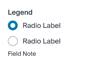
The radio buttons and labels will be "stacked" or vertically displayed. This can be used with a small or medium size data set. If there are going to be more than five or six options consider using a select field instead.
Boxed
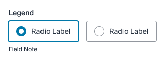
Boxed radio buttons are chunky buttons that highlight when selected. This can be used with a small data set (four or fewer), and ideally when all will fit on the same line, even on small viewports.
Guidelines
Alignment
The Legend should always be left aligned same as the label's. The radio button should be left aligned with the label related to it.
Required vs. Optional
By default Primer form fields are required, we encourage the pattern of all fields are required unless noted as optional. This helps ensure that only valuable form fields are being included in the form. Another pattern is to be explicit when giving context which means spelling out "(optional)" and not using an icon or special character to denote optional.
If the majority of the form contains optional fields, the inverse can be performed by only specifying the required fields with "(required)" instead of "(optional)".
Note: The inverse is currently not supported in Primer Angular components. The HTML version can denote only required fields with "(required)".