Color
Primer uses a subset of PPG's core brand colors
Primary colors
Primer by default comes with the PPG brand colors. (For more on PPG's brand colors, visit branding.ppg.com.)
Neutrals
Primer's neutral range runs from white to a bluish black, which we call simply "black."
Utility
Reserve these colors only for their associated status states (error, success, or warning). For neutral informational messaging, use neutral-black.
Utility tints
This tints may be used as accents to error messages—backgrounds or borders, for example—or when light text is required on a dark background.
Accessibility
Primer conforms to the AA standard of the Web Content Accessibility Guidelines. When selecting text and background colors to use, you must meet or exceed the following standards for contrast. (The WebAIM contrast checker is one of many tools for checking the contrast of two colors.)
Body text and smaller
Regular text must have a contrast ratio of at least 4.5:1.
Headings and other large text
Text that is 18px or larger (or 14px for bold text) must have a contrast ratio of at least 3:1.
Incidental and decorative text
No contrast requirement applies to text that is part of an inactive or disabled interface element, or that are pure decoration and are not essential to the use of the interface. For example, there is no contrast requirement for a form field's placeholder text, or for the text of a disabled form field.
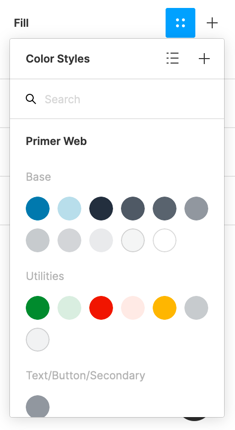
Using colors in Figma
Apply color to a text or shape by assigning the associated color style:
- Select the text or shape object to style.
- In the Fill section of Figma's right sidebar, click the four-dot Style icon to reveal the available colors.
- Select the color to use.