Using Storybook
Storybook is a tool that allows Primer to display the Angular Components in browser. This gives users a playground to test components and see how they function. This guide is for users who are not familiar with how to use storybook.
Navigating
To navigate Storybook use the left hand side panel. This panel is broken up into a few different sections.
Styles
These are global styles such as utility classes and all Icons available with Primer.
Components
This section lists all the available Primer Angular components.
Example Pages
This section shows examples of how page templates can be created within your app using the Primer components.
Example Recipes
This section shows examples how of re-usable components can be created within your app using Primer components.
Canvas
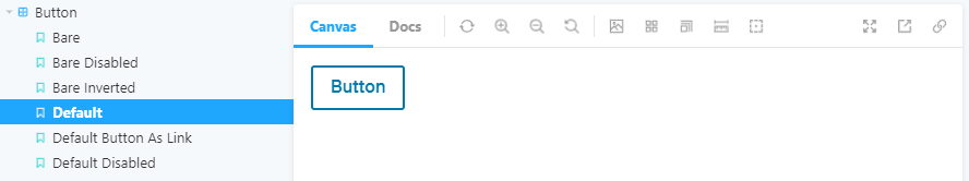
The Canvas in Storybook is where a single selected story will display. In the above example the default button story is selected in the left hand nav.
Controls
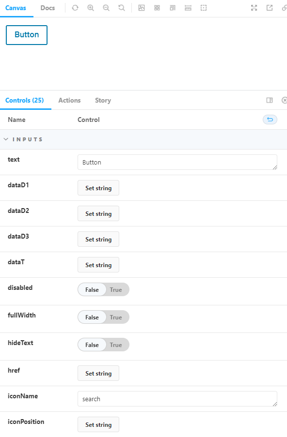
Under the Canvas, there is the Controls panel. By default this displays the values of the Inputs for the Angular component to create the component shown on the Canvas. These can be changed from any story to see how the component is modified by each input.
Be sure to reference the component guidelines on which inputs to use for certain situations. For example, when using an Icon button with text. The icon should always appear on the left side with just a few exceptions in left-to-right languages. However, the button component has to always allow for the icon to appear on either side of the text. It's important to ensure the guidelines are followed in situations like this.
Docs
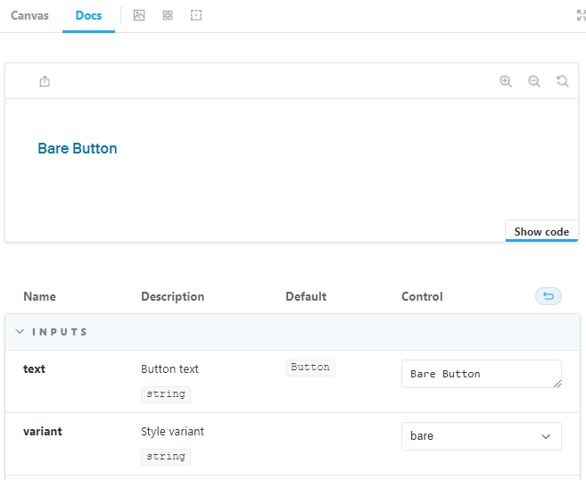
The Docs tab in storybook displays all stories under a selected component. This view also lists all the available Inputs on the Angular component with descriptions of each Input.
Code Samples
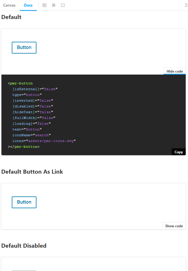
After scrolling past the Inputs section in Docs, the remaining stories will be displayed. Each story has the option of Show Code which will display the code block with the necessary inputs filled in to achieve the result displayed above the code block.
One thing to note with the code snippets, storybook will display props that have default values such as a Boolean defaulting to false. These Inputs can be omitted from the code and achieve the same result.
For example, the above code snippet in the screenshot for Default Button has these inputs defined:
Button
HTML<pmr-button
[isExternal]="false"
type="button"
[inverted]="false"
[disabled]="false"
[hideText]="false"
[fullWidth]="false"
[loading]="false"
text="Button"
iconName="search"
icons="assets/pmr-icons.svg"
></pmr-button>Many of those values are default and can be omitted to and it will achieve the same result:
Button
HTML<pmr-button
text="Button"
></pmr-button>Unfortunately this is a limitation of storybook. There are not any negative impacts of leaving the default values when using in your app it will only impact code readability.